Overview
During my time at NCR VOYIX, I created a comprehensive database connecting employee roles, major clients, and the research repository, streamlining the design processes by providing swift access to project data. Leveraging this database, I improved a warehouse management interface by tailoring it to user needs and insights.
“Who do I contact again for this project? I have a workshop with the client soon!”
the problem
The lack of centralized system led to significant challenges in accessing project data, particularly related to past collaborations with major clients. This hindered the research and design team’s productivity as valuable time was lost in search for relevant information and insights.
research
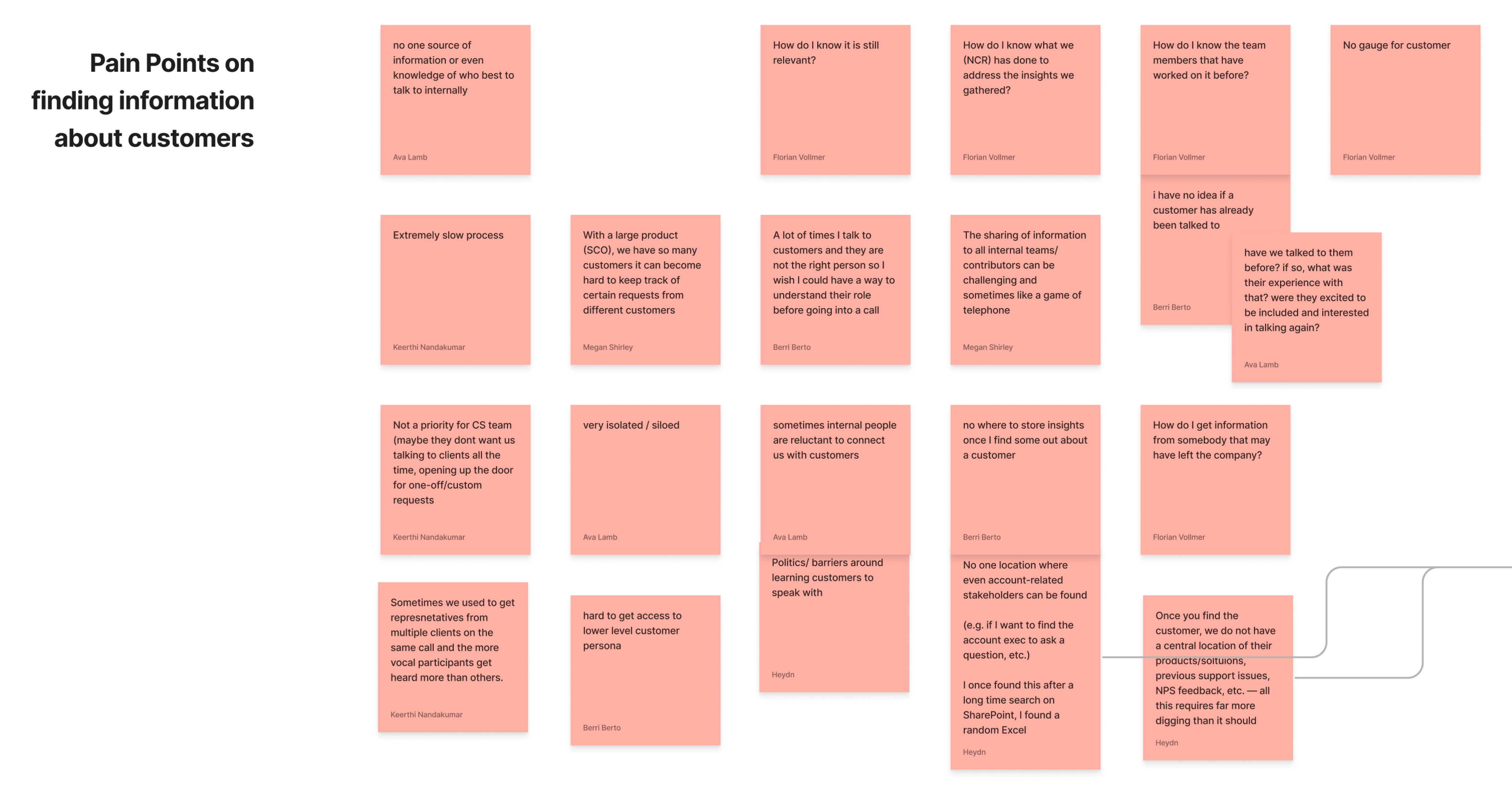
The initial ecosystem was chaotic—an array of disjointed files scattered across various platforms. Figjam boards lacked links to crucial interview insights from a project months prior. Personal Figma drafts were absent from the NCR library. Microsoft Sharepoint files led to inaccessible personal accounts, while presentations for different workshops were scattered throughout the NCR ecosystem, unconsolidated within outdated databases.
How might we improve information retrieval to increase productivity between the design and research teams?
research
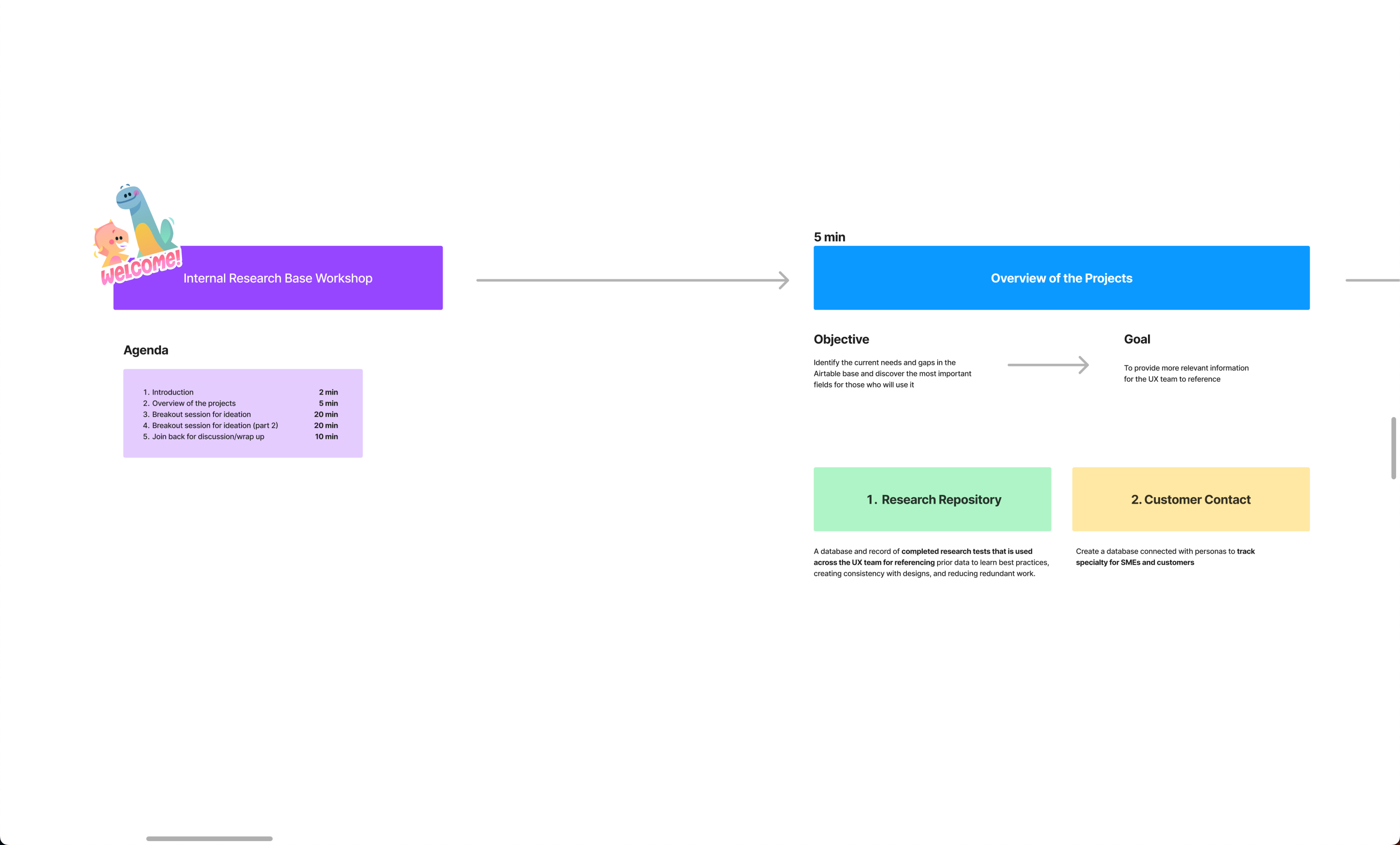
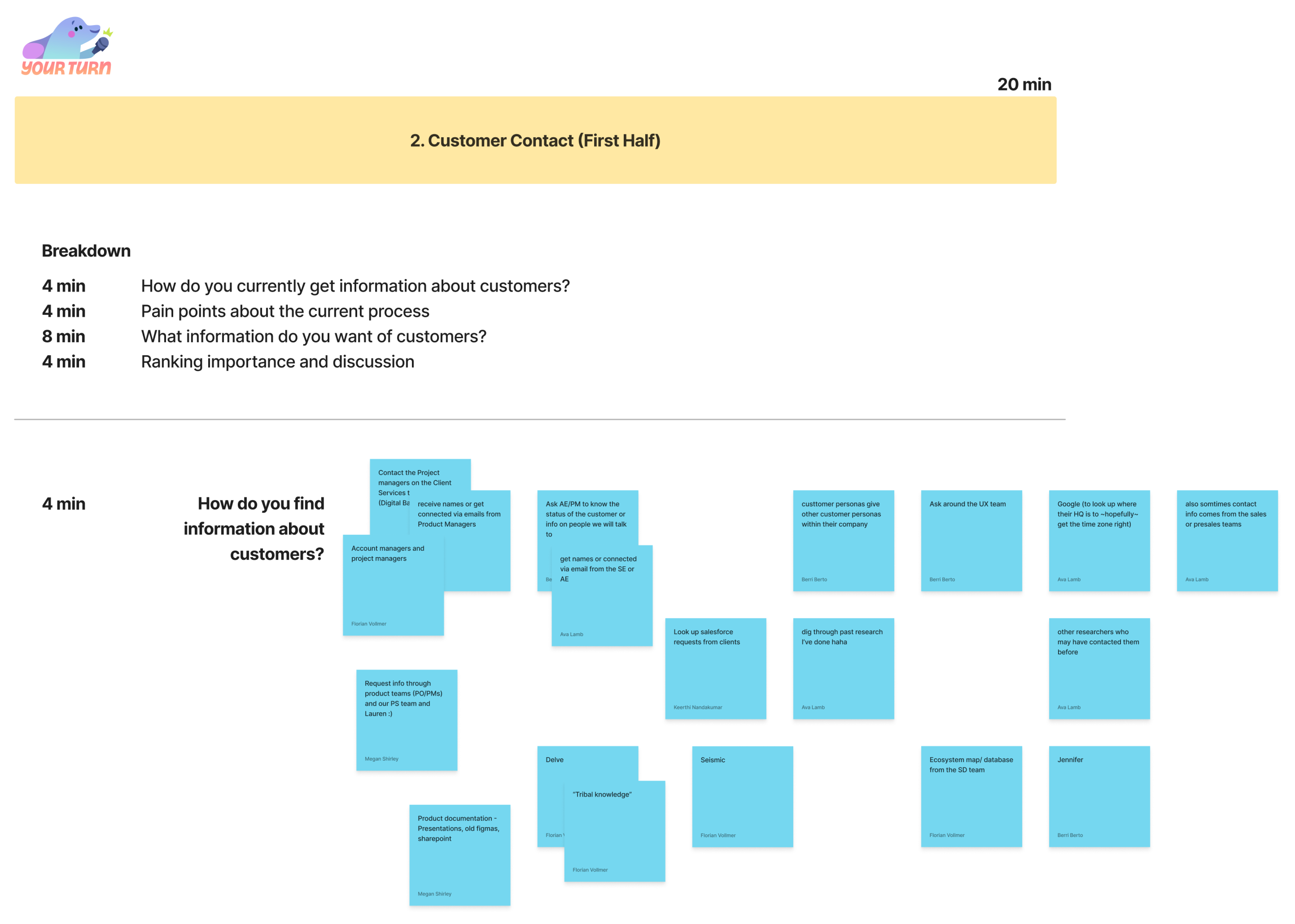
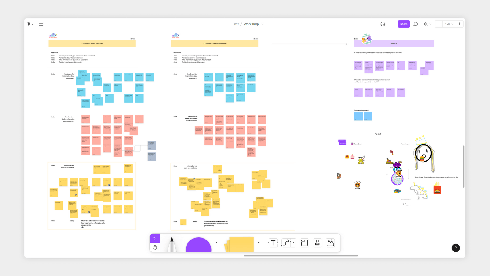
With these issues in mind, I co-hosted a workshop with Janie Pan to discover what researchers and designers need out of a centralized system. The main questions we wanted to ask were:
- How do you currently find information about a project or customer?
- What are some of the pain points with said process?
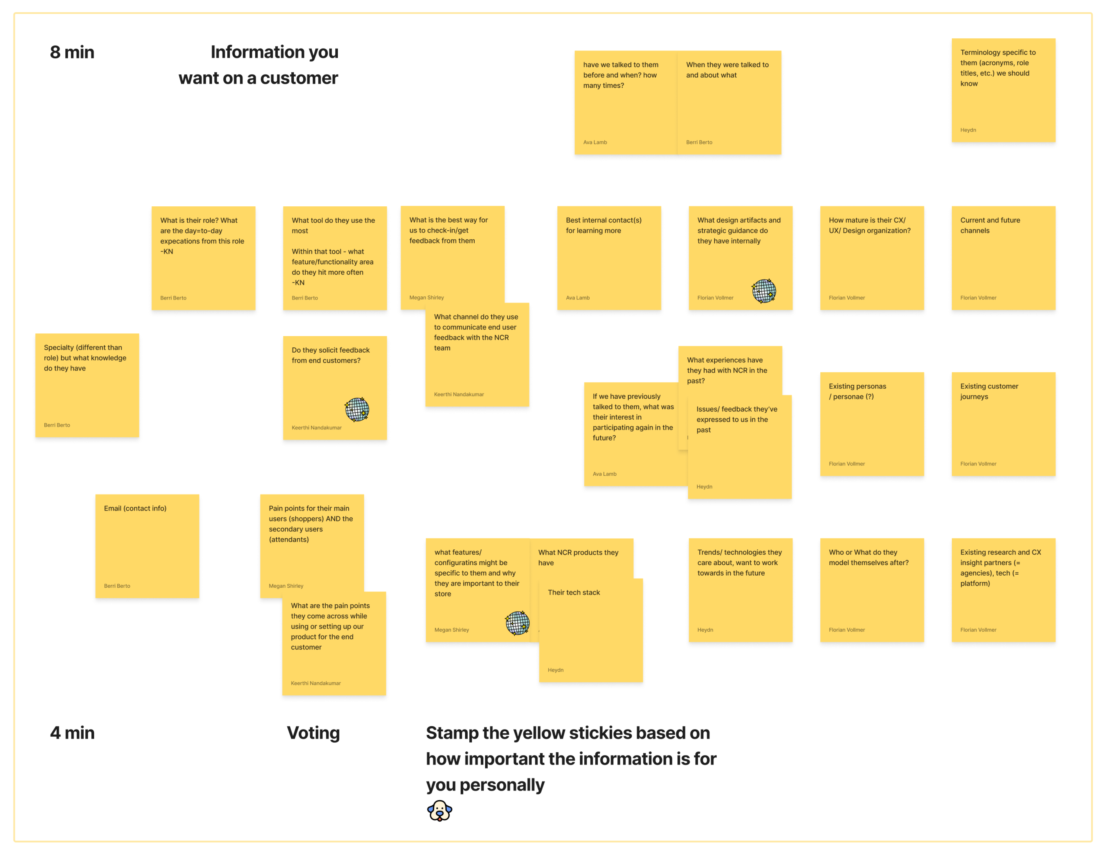
- What information would you like that is currently not recorded?
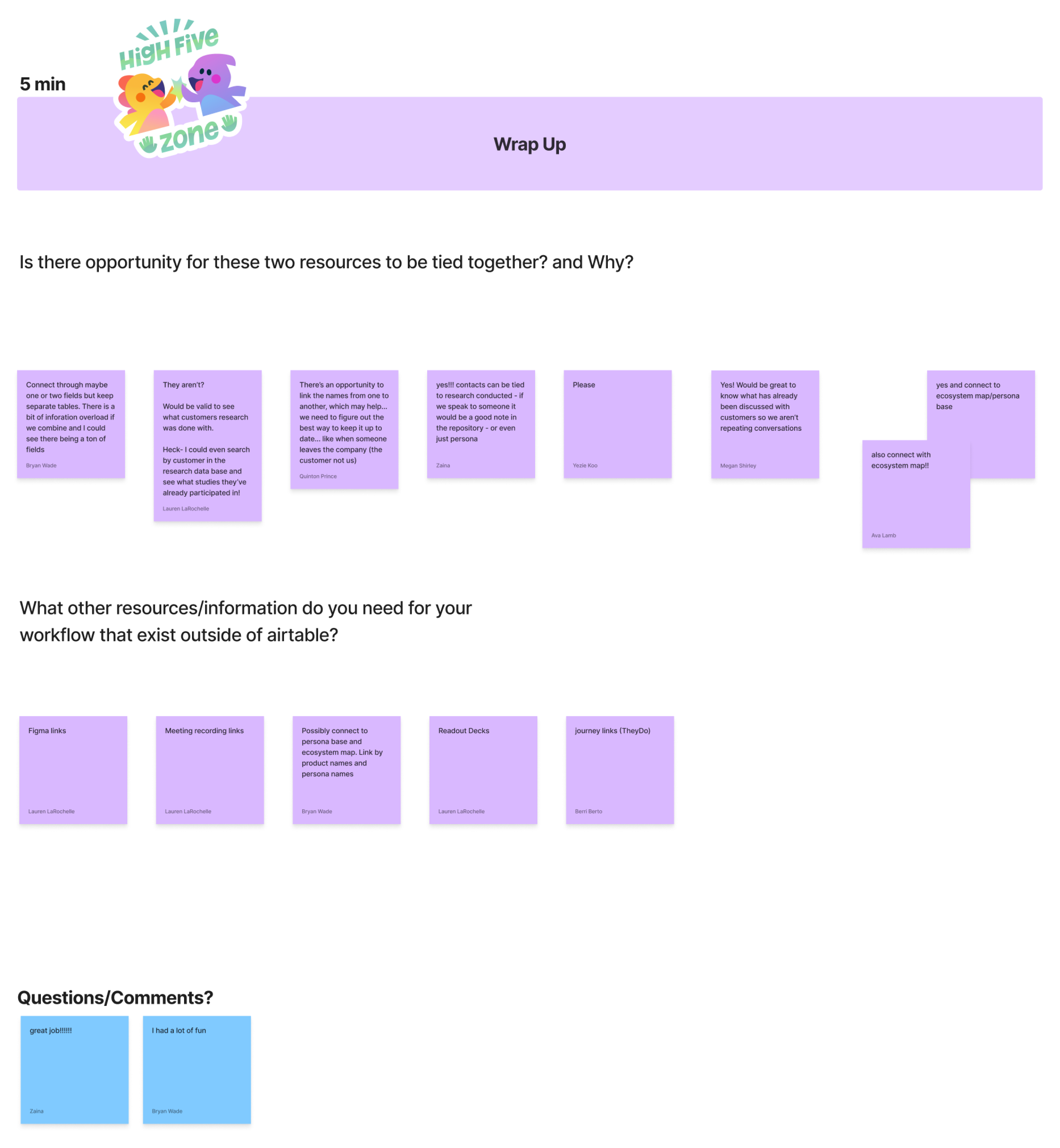
insights
From this workshop, I discovered three major issues:
- The outdated research repository and customer contact database demanded extensive upkeep, causing delays in researchers inputting their findings. Researchers felt overwhelmed when inputting their findings as the process lacked structure.
- Overlapping information within both databases led to confusion and frustration among designers seeking past research or workshop details.
- Crucially, designers lacked quick access to customer needs and goals through personas, as this vital information remained disconnected from the databases.
ideation
People wanted to use something familiar with a low learning curve for new users, so I started by comparing pre-existing software and systems that the team was already familiar with.
Airtable hit most of the checkboxes that the team needed as it was already a tool that was integrated into their workflow and it can link all the information they needed together. However, one issue I had to tackle was how to make Airtable new-user-friendly.
“Airtable is great for information, but I am so scared of using it because what if I accidentally change or delete something?”
testing
With this concern in mind, I did an A/B test of two different user flows regarding the full database.
final design
With an overwhelming majority favoring the documentation route, our centralized database was ready for launch and upkeep.
usage
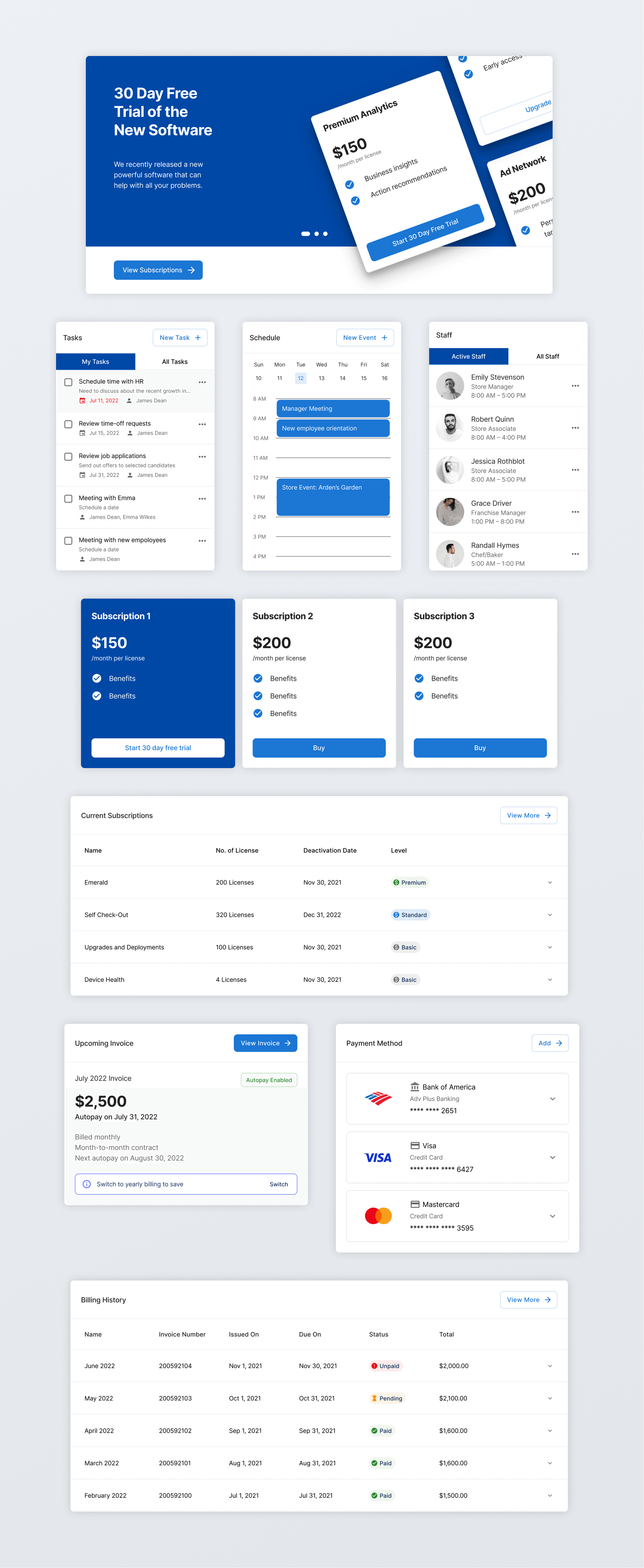
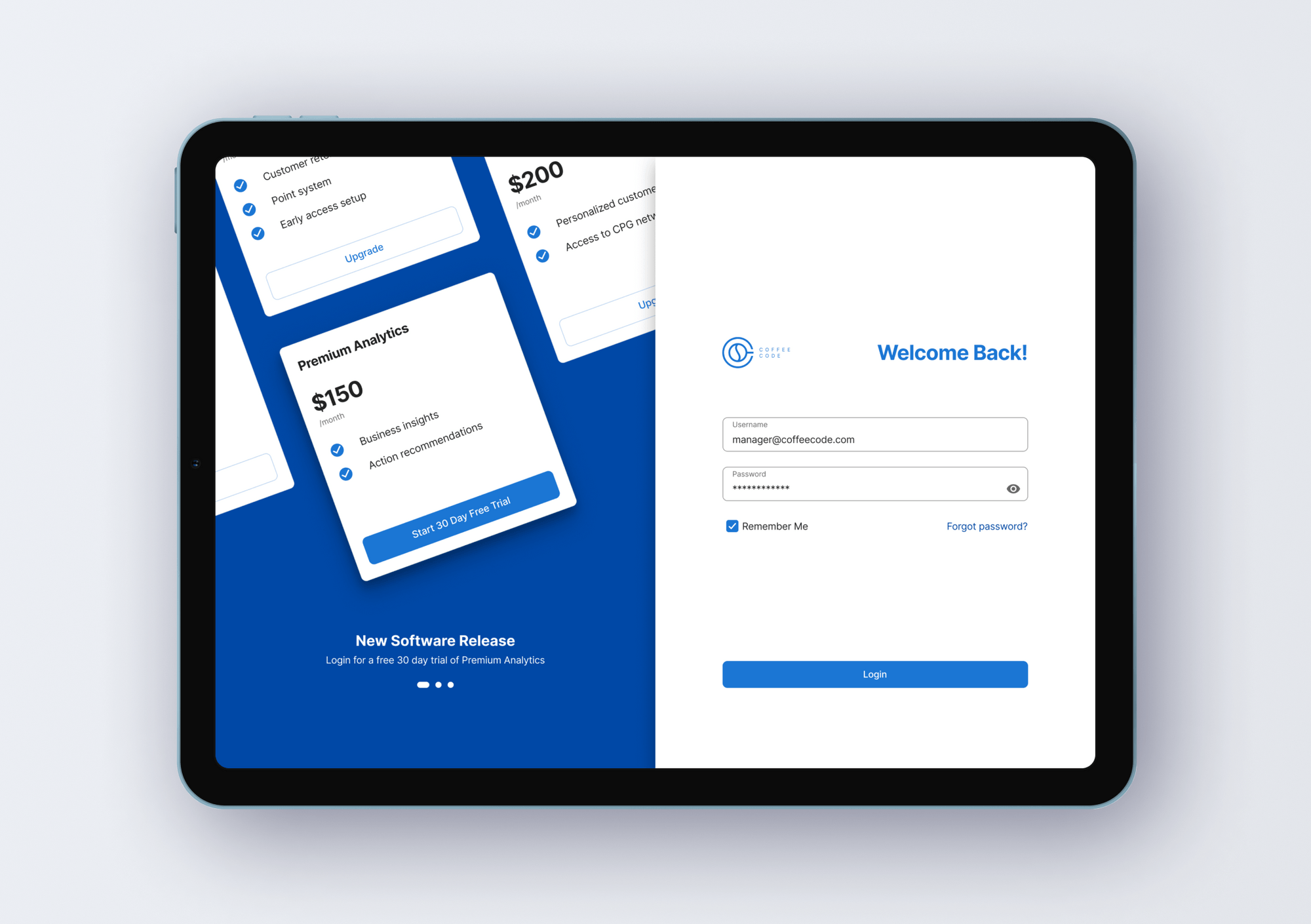
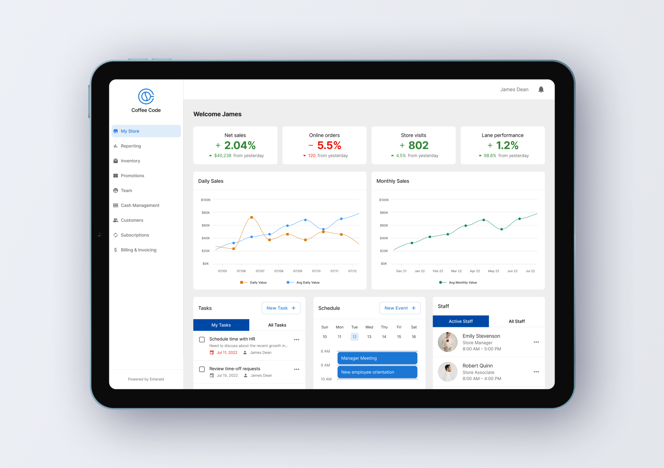
In parallel with the creation of the centralized database, I was also designing a finance dashboard for NCR’s customers, specifically for warehouse managers. Because I needed to find information related to the companies and the customer themselves, it was a perfect opportunity to test the new system.
reflection
During my time at NCR VOYIX, I improved upon invaluable skills that significantly enhanced my quality of work, ranging from learning research methodologies under the guidance of Ava Lamb to delving into service design principles with Berri Berto. One major highlight was presenting my work to the entire company upon project completion. It was immensely gratifying to witness keen interest from both the research and design team, eagerly anticipating the database's launch—an indication of its anticipated value within the organization.
“Is this live now? Does this mean I don’t have to bother Jennifer to find our past projects?”